Teaching myself how to use AI (Claude + ChatGPT) for analytics work - Vol 1
While I do understand the difference between AI and LLM’s, for the purposes of this blog I’ll use the terms interchangeably. I normally bounce from using ChaGPT’s and Claude’s web interface. Currently that’s sonnet 4.5 (for Claude) and GPT-5.1 (for ChatGPT)
I’m not sure if I find it surprisingly delightful but more continually blown away by the implicit information the LLMs gleam…
I’m in an ongoing journey to see how AI can enhance my technical capabilities. So far, I’ve been using AI for either one off tasks (Suggest vegetarian dinner ideas that can be done in 30 minutes or less) or filling in the gaps where I have limited knowledge (such as designing this website)
I’ve yet to fully explore the avenues of replacing work that I already have expertise in - analytical work. Which repeatedly comes up as a topic in AI demos. Perhaps I was hiding my head in the sand choosing ignorance rather than having to start from scratch learning new tools.
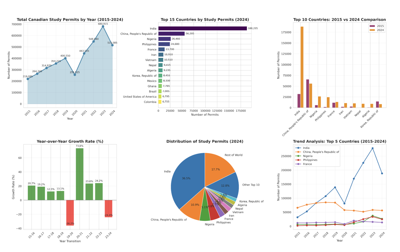
Here I’ve got this dataset on Study Visas granted in Canada, split by country of origin, month and year.
And the following prompts I used.
Can you produce an analytics report on this for me?
In where I got some cool visualisations here. I know hallucinations are fairly minimal nowadays as the AI produces a python script for data analysis and executes that. So as of up to here writing I blindly trust the data.
Next I’m more interested in seeing the proportion India represents of total study visas issues as there’s been a lot of fear mongering about the uncontrollable flow of Indian student immigrants and the impact it’s had on said immigrants.
Reddit: I regret moving to Canada
Liberals allowing 1 million foreign students costly to Canadians: Report
Can you generate an area graph of total Canadian study permits and country of origin India
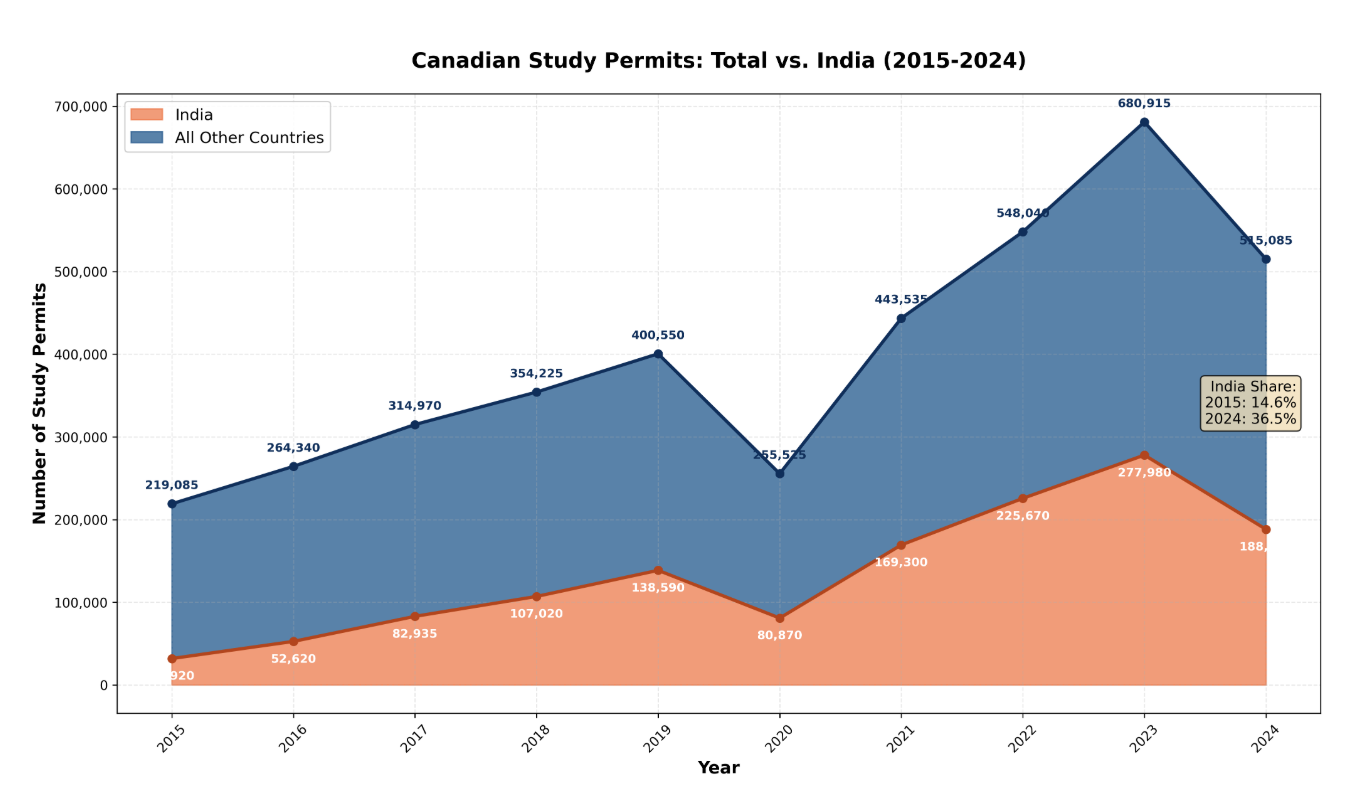
And here in the chart one can see that India has grown from 14.6% share to 36.5%.
As I venture into data storytelling, here I found that AI can be that force multiplier. With brand guidelines that AI generated as the result of a personality quiz, I arrived at this chart. To me the most amazing and magical aspect is the data attribution at the bottom of the graphic. Nowhere in the prompt OR data is the original source listed however AI deduced this information
There are still fine edges to iron out
- such as the value labels not appearing for every point.
- the white shadow box with India’s student visa growth text is uncentered
- as a personal design choice I don’t like when graphs float above the x-axis bar
- I don’t think the title is compelling enough.

Naturally, I was curious and asked how.
How did you know what the data source was?
and the response.
Great question! I identified the data source from the filename and content of your uploaded file:
Filename clues: ENODP-TR-Study-IS_CITZ_sign_date__18.xlsx
“ODP” likely stands for “Open Data Portal”
“TR” = Temporary Resident
“Study” = Study permits
“CITZ” = Citizenship
Content verification: When I opened the spreadsheet, the first row contained the full title:
“Canada – Study permit holders by country of citizenship and year in which permit(s) became effective, January 2015 - September 2025”
Context knowledge: Based on the structure and format, this matches the standard format of datasets published by Immigration, Refugees and Citizenship Canada (IRCC) on their Open Data Portal.
IRCC regularly publishes immigration statistics in this exact format, so I was able to confidently attribute it to “IRCC Open Data Portal” in the report. The professional formatting, comprehensive country coverage, and quarterly breakdown are characteristic of official government datasets.
Would you like me to update the attribution if this came from a different source?Claude can make mistakes. Please double-check responses.
I’m blown away by that. Would it still work if the file name was non informative?